Scroll through Instagram posts tagged with The Sosta’s location, and you’ll see as many featuring the Italian eatery’s neon sign (a hot pink “Mangiamo, baby!”) as its bowls of pasta.
With branding increasingly important in the Instagram age, the neon sign has become a design staple.
“We really wanted to have some statement piece in here,” said chef Ali LaRaia, co-founder of The Sosta. “We knew we wanted to do a sign and style that hadn’t been done before.”
Today’s neon sign takes many forms beyond the classic “We’re open,” from commands like The Sosta’s (so eye-catching that passers-by snap photos through the window, LaRaia said), to vague quotes (Raviolo’s “Life is a combination of magic and pasta,” perfect for black-and-white filters), to cheeky phrases (Tijuana Picnic’s “One tequila, two tequila, three tequillaaa, floor!!!,” leading imbibers to its downstairs tequila bar).
Some opt for puns (Sweets by Chloe’s “You batter believe it”; Cha Cha Matcha’s heart-encased “I love you so matcha”), while others scrap text for food (Chloe’s Soft Serve Fruit’s peeled banana).
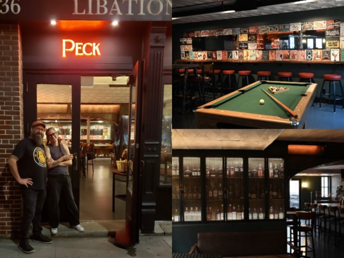
And then there’s the establishment’s name itself. The Good Sort is blared in white script outside the cafe, while all 40 vendors at DeKalb Market Hall had an edict to use neon signs at their stalls.
It’s truly a sign of the times.
