By Lincoln Anderson
Is the Mona Lisa smiling? Is Stonehenge a giant calendar? Are Jerry Garcia ties really worth 30 bucks?
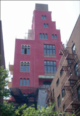
These are some of the great artistic questions. It appears another one now must be added to the list: What color really is Julian Schnabel’s new building at 360 W. 11th St.?
What it’s definitely not is hot pink, according to a Schnabel associate who is working closely with the renowned artist and filmmaker on the new 17-story tower between Washington and West Sts.
Brian Kelly said Andrew Berman, director of the Greenwich Village Society for Historic Preservation, was way off base in calling the tower “hot pink” in The Villager last week. And Kelly stressed that Schnabel certainly did not pick the shade to get back at neighbors for opposing the tower, as Berman suggested, but because he liked it.
Following The Villager’s report last week, the story was picked up by The New York Post and U.P.I., the global news wire service, as well as numerous real estate blogs.
Kelly invited The Villager up to the site on Monday afternoon to take a closer look at the building. A TV crew from Channel 2 News had just finished doing a story on the building’s color. The TV reporter had gotten Schnabel on the line from Europe, where he is currently traveling. According to a source, Schnabel called the building’s color “Pompeii red” — and was “quite upset” during the brief interview.
Kelly said the sudden media frenzy is distracting him from the task at hand of finishing the building. He says they still have two and a half to three months until completion.
At first, Kelly dubbed the building’s color “dusty rose” — then later said Schnabel is describing it as “Venetian red.”
“It’s straight out of Cuba, or Venice, or Florence,” Kelly said of the building’s design and color. “Venice mostly — it’s Venetian. There’s buildings like this in Naples, in Palermo, Sicily. If you go to Cuba, you see buildings like this.
The color will get deeper in the rain, and pollution will darken it over time, he added.
In addition, because the stucco didn’t cure properly, some of the white came through, Kelly noted. But he said Schnabel loved this fortuitous effect, which gave the paint a faded look — and ordered it not to be touched up.
Beyond the color, Kelly said the European-influenced building is quite unique. It has 18-foot-high ceilings. Its large French windows will open to catch great breezes off the Hudson River, he added. It’s built with solid, 3-foot-thick block walls — not sheetrock — he noted. Balcony railings will be made of brass. The floors will be mostly tile.
“There’s a lot going on here that doesn’t meet the eye, and Andrew Berman is not the authority on any of it,” he said.
Kelly challenged a reporter to poll passersby on their feelings on the building.
“We hate it!” spat a tall, silver-haired man as he purposefully strode down 11th St. carrying a gym bag. “We spent $5,000 to keep the son of a bitch from doing it.”
Asked what color he thought it was, he retorted, “Blood red! — It’s the final color!”
Riding by on his bike, Michael Pomerantz, from Bethune St., said, “Well, it looks like wine. I don’t like the building. It’s ugly, it’s too tall for the neighborhood.”
Another man walking on Washington St. said, “I don’t particularly like it.” Asked what color he thought it was, he said, “Magenta, or something like that. It’s too tall. It interferes with the skyline, just like all the development…,” he said, nodding toward the waterfront.
A woman who works in the area and was on her lunch break, said, “It looks like a reddish-pinkish color to me. It looks old, too, like it’s washed out.”
Sid Levitt, an Upper West Sider who was visiting his wife at HB Studio, where she teaches acting, called Schnabel’s tower “dark pink.”
“The only thing is the color is a little controversial,” he said. “White might look a little better, but pink’s O.K.” He felt the building echoes other Mediterranean influences one can find in Village architecture.
“I think it’s red,” said Laura Stein, who was walking her dog. “I was against having that building. It’s too big. But I prefer it to the Richard Meier glass tower buildings. If I had known it was going to be red, I would have thought, ‘Oh, how horrible.’ But it does have those streaks — like beige paint ran down.”
“Pink to me is Pepto-Bismol,” stated John Drazin, a neighbor. “That to me is like a rusty, deep red,” he said of the building. “Also when it mixes with all the soot in the air the color will darken.”
Toni Dalton, the Westbeth resident who took the photo of the tower that ran in last week’s Villager, is a trained artist and knows her color tones.
“Right now, it’s hot pink with drippings,” she said of its exterior. “It’s an undercoating for the next coat, which I don’t have a clue what it will be,” she presumed. “Most people hate it — except for some artists that I know, including me, love it.
“The building itself is so beautiful with its arched windows and doors leading to very large terraces,” Dalton said. “Each floor is different and the ceilings are very high. It’s so European. The color right now is so much fun. It’s such a relief from these big glass towering monsters that they’re assaulting us with here in our used-to-be Village. It’s so interesting.”
Meanwhile, for his part, Berman, G.V.S.H.P.’s director, remains unapologetic for calling the building hot pink.
“I heard they were calling it ‘Pompeii red,’” he said. “It’s splitting hairs. The color is just the icing on the cake, unfortunately. I would challenge Schnabel to show me a 17-story enormous box of a building like that anywhere in Florence or Naples. Frankly, I don’t care if it’s pink, green or blue — it’s still totally inappropriate.”


