
For Rich Tu, the boundary between New York and New Jersey is more than just a line on a map: it is a living, breathing intersection of culture, identity, and artistry.
As a first-generation Filipino American raised in South Orange, New Jersey, now living in Brooklyn, Tu has always moved fluidly between the energy of the city he calls home and the quieter upbringing of his childhood roots.
“Growing up in South Orange, you know, and New Jersey overall, I loved it,” Tu said.
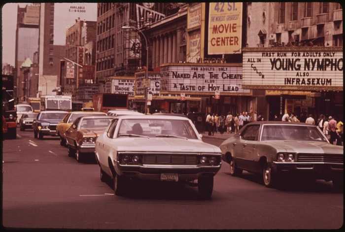
“What I loved about the area was how local it was. Growing up out there, it’s like right immediately south of Newark, but also, it’s very accessible to New York City. So it’s kind of a commuter town. You can get to Manhattan, like, really fast.”
Much like the kinship between the two states, Tu’s background is intertwined throughout his work as Executive Creative Director and partner at art studio Sunday Afternoon, as well as his teaching role at the School of Visual Arts in Chelsea.
This unique perspective would serve as the perfect foundation when Tu was chosen to design New York/New Jersey’s official poster for the 2026 World Cup. When FIFA reached out, it was another opportunity for Tu to fuse culture, passion, and a bit of geography through his work, this time on a global scale.
“[When FIFA emailed me,] I freaked out almost immediately. It was incredible,” Tu recalled.
“[They] reached out right at the beginning of the year, almost right after New Year’s. So you’re just wiping away the cobwebs [from] the holiday and all that stuff. Then, I received an email from someone from FIFA, and they asked me if I was interested in designing the World Cup poster for New York and New Jersey, and I was ecstatic, and also I was a little bit in shock.”
The official World Cup poster series, commissioned for each host city, tasked local artists with capturing the spirit of the beautiful game and their city’s identity.
For Tu, that meant finding a way to honor two distinct places that often get lumped together, yet carry deep individual pride. His poster brings both states to life, bridging them through color and plenty of visual symbolism.
“[FIFA and I] immediately aligned early on the Statue of Liberty as a theme and a motif, and all the other elements kind of sprinkled in all along the way,” Tu said.
“It was a really organic process, and they were great collaborators. So, I was just really happy and humbled that they were willing to choose me and work with me, and also, that we were able to feed into each other’s influences.”
The design reflects those influences and then some, peppered with a distinct tri-state area flair and personal touches that perfectly encapsulate Tu’s style.

Whether it was the bold orange palette referencing New York’s iconic relationship with the color, or the dark blues mimicking the nightlife of ‘the city that never sleeps,’ Tu’s poster is rich with layers of references that would make any local beam with pride.
“The color orange is such an iconic sports color in New York with the Knicks and the Mets. But also, I grew up in South Orange, so that has its own dual meaning to me,” he said.
“Then, for the darker color palette, we wanted to have that darker blue in the background to let the colors pop, but also this idea that New York is a city that doesn’t sleep. It’s like, it’s always on. You know, kind of like walking through Times Square, or just the lights are always on. So that was also an intentional choice.”
Another big touchpoint for Tu was making sure his heritage was represented in the poster by adding floral details of the Sampaguita, the national flower of the Philippines, an artistic choice Tu said was “received really well” by the host committee team.
“Something that lives within the FIFA poster [are the] little floral patterns that are calls to the Sampaguita flower, which is the national flower of the Philippines,” Tu stated. It’s a connective element within the larger tapestry of the poster. It’s there if you know how to look for it.”
The authenticity extended to the rollout itself, when the poster debuted at the Poster House in Manhattan and continued through a wheatpasting activation in Jersey City, a city with one of the highest concentrations of Filipino Americans in the US.
“Jersey City has one of the highest populations of Filipinos, the Filipino diaspora in the country, outside of the Bay Area in California, so that was near and dear to me too.”
For Tu, the poster is more than just an event visual; it is a living story of two places illustrated together through his artistic lens.
“I hope people feel proud. I hope that people feel a sense of joy and excitement,” he said.
“What I love about every city getting its own moment is that every city gets to experience the joy and excitement on a very local level. So it’s the world, but the world touching the local field – it’s civic pride.”
From the streets of South Orange to the studios of Brooklyn, Tu has woven his background, heritage, and love for both cities and states into every inch of the World Cup poster.
More than a design, the poster serves as a lovely tribute to the two places that shaped him, brought to life through cultural symbols, splashes of color and a deep local pride.