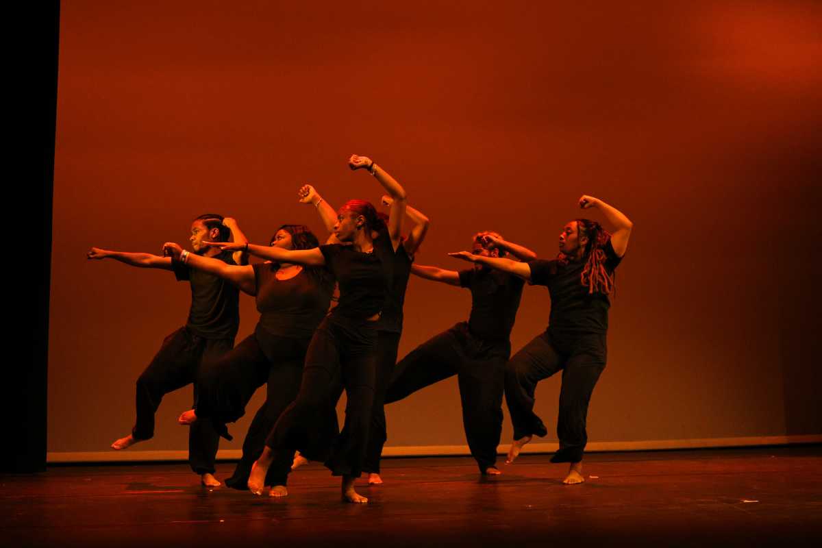

As daffodils bloom and trees begin to bud, color is creeping back into the city. If you just can’t wait for spring to fully emerge, however, “Spilling Over: Painting Color in the 1960s,” the compact new show at the Whitney, can add a bit of brightness to your day.
Spaciously hung in naturally lit galleries on the museum’s top floor, the exhibit’s 18 paintings, created between 1959 and 1972, were selected solely for their embrace of color. Curator David Breslin says that the tendency to classify artists based on movement — this is surrealist, that is minimalist — can stop us from “thinking about what motivated and brought people together at the time.”
“I think that instead of that impulse to pull apart or segregate, [this show was motivated by] the impulse to bring together and see what an integrated way of looking might be,” Breslin says.
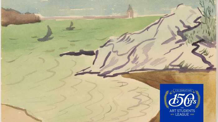
The works are all drawn from the museum’s collection, including two making their Whitney debuts: Kay WalkingStick’s spare “April Contemplating May,” featuring an orange silhouette of a woman casually regarding the blue-hued sky outside her window and Emma Amos’ “Baby,” depicting a woman split in two, amid an array of primary and secondary colors.
Sam Gilliam’s “Bow Form Construction,” a giant frameless canvas, is found folded and draped between two anchor points on the gallery wall. While chromatically among the most muted in the show, its illusion of having been abandoned and tossed aside draws the viewer in. “It really kind of intrudes on your space, it’s a presence,” Breslin says. “And I think that idea of making a presence so that you’re more conscious of yourself and what brings you to a space, that reflex to think about others around you, it becomes a gathering.”
The most striking impression of this gathering, particularly in a gallery full of black-and-grey-clad New Yorkers, is the dazzling color and how variously it is employed, whether for the geometric formalism of Ellsworth Kelly’s Technicolor lozenges in “Blue Green Red” or the figurative abstraction of Bob Thompson’s faceless, jazzy, Renaissance-inspired “Triumph of Bacchus.” It can throw you off balance, as with Richard Anuszkiewicz’s dizzying matrix of blue and green cubes in “The Fourth of the Three” or ground you, as in the organic shimmer of Helen Frankenthaler’s “Orange Mood.”
With any exhibit delimited by chronology, particularly from an era as tumultuous as the 1960s, it is useful to remain aware of the outside events influencing the art. “There can be politics and there can be beauty, and they don’t need to be separate from each other,” Breslin says. “I think a lot of these artists were thinking about that.”
‘Spilling Over: Painting Color in the 1960s’ opens Friday at the Whitney Museum of American Art, 99 Gansevoort St., whitney.org